Showing posts with label artists. Show all posts

14/02/2017

Inspiration: MinaLima's Harry Potter Graphic Design Exhibition

This is pretty old now, but I realised after Geoff dragged me in my assessment that I haven't got even half the exhibitions I visit on my blog, so here we go!

During the summer I spent the week after working my butt off at Hyperjapan hanging with some friends I don't see too often and we went to a few different exhibitions (including the Cosmonauts exhibition at the Science Museum, which I wrote about at the time). MinaLima, a graphic design company in Soho had their pop-up exhibition on on the graphic design they did for the Harry Potter films, so we went there.

I've never particularly thought hard about graphic design for films, unless it's for animations, at which point I obviously consider all the design. While this might be because I don't particularly watch many non-animations, it was also really eye-opening to consider the work that goes into film design on its own. MinaLima is obviously a very good studio, obvious from their choosing for such a big film franchise as Harry Potter, and in their exhibited work.


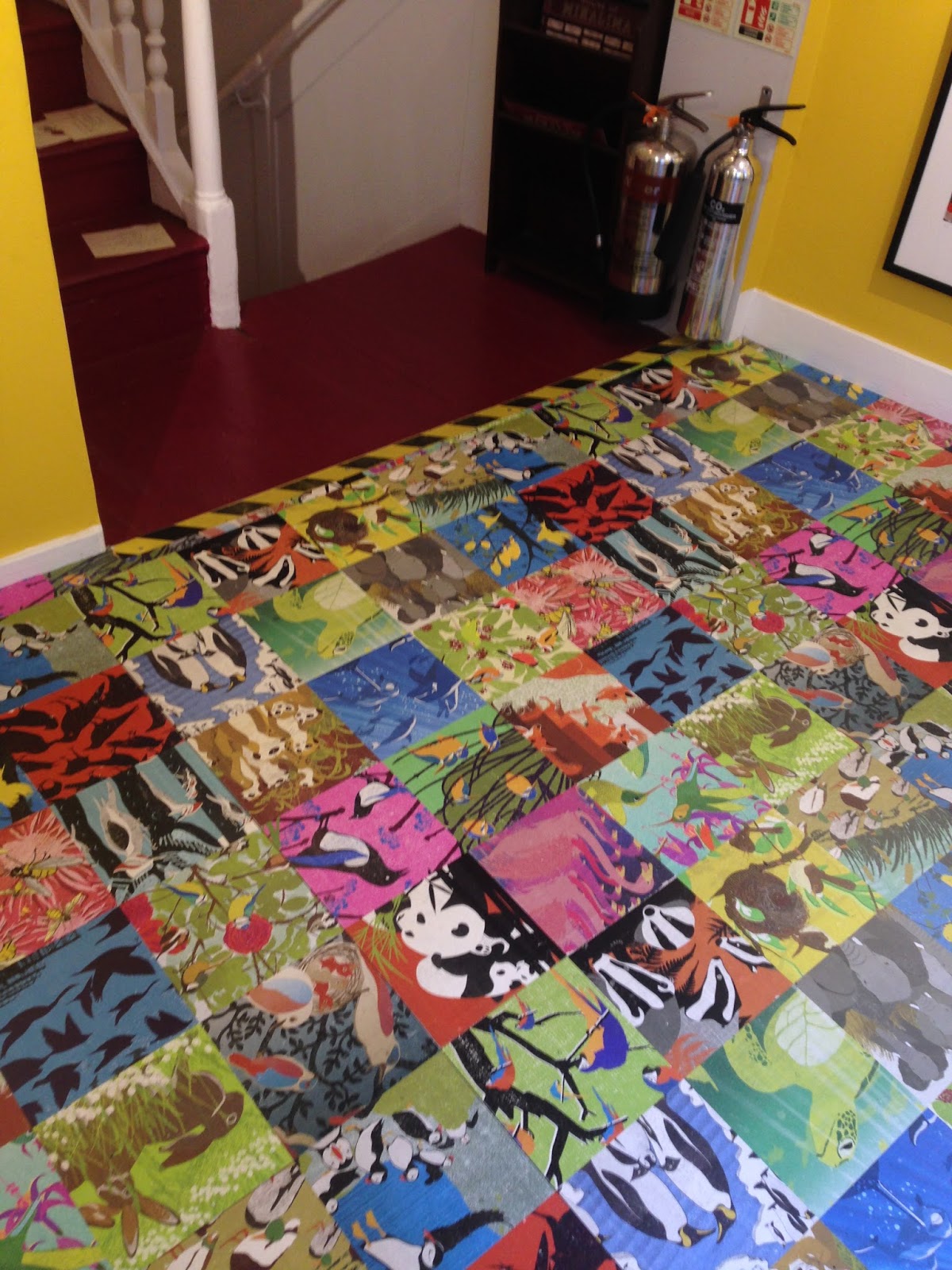

The first floor of the building was dedicated to non-Potter related projects, in this case, illustrating bold posters of animals in groups. The posters use striking colours to suit the bold use of flats, and maintain interest by often going for quirky animal groups and their names. The text placement is always careful and environment was well-considered when thinking about compostion and colour scheme.

They're also quite interesting for how they curate work: being in Soho, they have limited space and therefore have to manage it well in order to exhibit a lot of work, and yet not let it seem cramped or overly busy. They get by this by splitting the building's floors down by project, as well as using creative print techniques, such as wallpapering designs onto the floor and walls.


This works incredibly well with the newspapers and WANTED signs, giving the effect of mania and mimicking a typical setting for posters of these sorts, which in themselves are designed to be cluttered and imposing.

The Daily Prophet itself obviously takes inspiration from British tabloid press in the books and I liked that this comes out in the design, with the studio choosing very bold, facist fonts not unlike those of the Daily Mail for snappy headlines. That said, they also have that ~wizard-y~ twist, with inspiration from Victoriana, particularly in the illustrated adverts (bottom left of the last photo), as well as something of quirkiness in the way the direction of font changes.


I particularly appreciated that they pay close attention to the use of their design and let that inform their choice of materials: for example, designing a Hogwarts wax seal and embossing the Chocolate Frog packaging with gold (also, while writing this, it just occurred to me that Chocolate Frogs are probably inspired by Freddos! Woah). The diversity of design and uses while still retaining a sense of personal flair is also amazing.


01/02/2017

Project: Library

This was quite a quick turnover project so I feel like I'm somewhat lacking in sketchbook stuff for this. I had a run of 6 events in November '16 and was just really tired, and the sessions for this ran on Fridays, when I was at work.

The brief was to create either a record of or an entry for a library, or do our own collection. We were supposed to pick a library but I set my heart on Salford Zine Library. I've always loved zines, there's soemthing very intimate about them and I own quite a lot.

The library houses thousands of zines but I was particularly interested in one of their most dedicated ziners, Emma Falconer, whose perzine series "Fanzine Ynfytyn" is really interesting: off the wall in design and yet so personal. The things she writes about and collects clippings from remind me of conversations I used to have with my mum: I read a lot about random stuff and love dumb facts but the only person who would listen to them was my mum. It takes some kind of courage to think they're worth collecting into a series of zines.


I decided I wanted to do a perzine of my own- I tend to do zines aimed at an audience of sorts, instead of just about my own thoughts- and thought a collage-style zine about my favorite books (a library in itself) that I could sent to Salford Zine Library to become part of the collection really completed the cycle.

The front is a self-portrait, the whole think is digitally collaged with either photos or my own illustrations and some personal reflections. I also designed a number of patterns for use as backgrounds, such as the books and the mushrooms.

This is a lot easier to read if you download the PDF from my Gumroad.


Overall this was a relatively successful project. It makes for a pretty cool zine and it one of the more effective uses of my own art style this year. Some pages have soe dead space and I made a few mistakes, particularly with scanning images from hardback books, plus I feel some of it is too neat or lacks the edge Falconer's zines do.

09/08/2016

Inspiration: Pick Me Up Graphic Arts Festival

Pick Me Up runs every year at Somerset House and features a selection of up-and-coming graphic artists and illustrators, as well as housing workshops, collectives, and print companies. This is the first year I've been (I didn't even know it existed) and it was a great experience! I went with a group of people from uni, though I suspect I would have gotten more out of it with people I worked with or similar, or just people who were on time.


The exhibition opens on the basement floor to the selects chosen by an industry panel, which I found really interesting until we dicovered the ground floor. There wasn't anything wrong with the work from the selects, I just found it very artsy and a bit sketchbook-y, which I suppose is the point given they're up-and-coming; the work was great but felt very fine-arty and not incredibly refined. I've only photographed my favourites so perhaps this won't come across.


Marie Jacotey is a French illustrator living in London. Her work uses obsessive imagery, with her PMU selection meaning to imitate a teenager's bedroom. In terms of curation, the flaw in this is that the wall isn't even remotely busy enough to be obsessive- I think that would have been a great opener too.

Also, if you want to know why my opinion matters on this, check out the photo one of my friends took of me, an obsessive teenager, in my bedroom (for a project on non-binary people):


I also liked the work of Corin Kennington, who has really neat lines and does great work with letterpress. He was also at New Designers.


Dutch illustrator Aart-Jan Venema also caught my eye with his colourful and detailed watercolours. His paintings for Pick Me Up were takes on everyday situations in is own style, injecting humour and quirkiness naturally and effortlessly.


Then came probably my two favourite selects, starting with US game designer and illustrator Julian Glander, whose work was super quirky and fun. I loved the foam sculptures of course, but I also think they stole a bit from the fact his illustration/print work was really quite something. It had a relevant internet-y aesthetic about it, and the colours were well chosen and very much my jam.


Charlotte Mei is a Camberwell graduate which is pretty sweet! What's more exciting is that she doesn't seem to sit in the house style of Camberwell either, which makes her even more interesting a find. Her work and the themes she explores reminds me a lot of Tiffany Liao or OMOCAT, who's an artist who has greatly inspired me. She had a really broad range of work compared to other select, both in terms of quantity and style. I particularly liked her pots, which is I gather now mostly what she's pursuing, particularly her ceramic mobile, which is a jibe at everyone harking back to "the olden days" with an impractical yet somewhat functional object, and examining the tensions between traditional and modern media.


Camilla Perkins' work was also very refreshing, and although her actual exhibit in size and variedness was underwhelming compared to the rest of the selects, it seemed the most refined, which is reflected if you google her past clients. Her style is one I've seen before and like (or not quite the same, but similar styles with consciously naive form, heavy use of pattern, bright colours and a lot of potted plants, for example Tuesday Bassen, Kristyna Baczynski and Beau from my class) but different in that for a start, although she is white, her actual work isn't as white as this style tends to be (which in my opinion is overwhelmingly so). Her depictions of African subcultures are engaging and fresh and I was really pleased to find these are far from the only work she's done on such subjects.


Thus concludes the selects, which is where I thought the exhibit ended, but it turns out there was an upstairs which in my opinion was much more exciting. This was where companies, collectives and print houses exhibited and ran workshops, and the work was much more commercial and exciting.


I particularly liked that they stimulated audience participation in so many ways, including the little ways, as sometimes the arts can be a bit inward looking so I'm always down for people putting stickers on a wall.


I also found some ideas to keep for later, such as the cut-out concertina idea from Hato Press which I used for my Simone de Beauvoir project.


Overall it was a great afternoon and we stayed until after closing time. It was definitely one of the more exciting exhibitions I've been to, with a good range of work and a lot of people with genuine passion for what they do.