It's 2017 and no one uses Blogspot?
Though I do like having this here and being able to write like no one reads it (which they don't), it can be a bit overwhelming to have to write full-on blog posts when sometimes I just have an idea or an opinion useful to my work I want to record.
Because of this, I set up a blog that runs in parralel to this one focusing on my IPS on gentrification, and includes personal photos, thoughts, artists doing similar work, etc: Fuck No Gentrification LDN.

Showing posts with label art talk. Show all posts
Showing posts with label art talk. Show all posts
09/10/2017

Inspiration: Shaping Fashion Balenciaga
I don't know much about high-end but if you've ever met me it's clear I do like fashion, and i guess I move to my own rhythm on it? That's not to say neither high end fashion nor trends don't hold inherent interest and value, it's just a matter of personal taste.
Particularly, I'd never find myself wearing Balenciaga but I'm really interested in it as art: it has such beautiful form and shape and I picked up some applicable wisdom while I was there (that an outfit should consider form, and the best types for flattery were mixing baggy/shaped and form-fitting in one outfit). He (and designers inspired by him, which arguably pushed the limits of fashion further than he did in his more conservative and less technologically advanced time) isn't afraid to use bold shapes and I found myself finding them interesting from a cartoon standpoint- I love children's animation with a diversity of body shapes, that pushes the understanding of the form of the human body (though I can take or leave the "mom figure" with the really wide hips because honestly it's tired?). I've been trying to simplify the way I use shapes and lines this summer, thinking about entire characters (or even just faces) as a square, or a triangle, and trying to stick to that:


Anyway, I wasn't expecting a revelation from the Balenciaga exhibition at the V&A at my nan's suggestion when she came to visit me in London but I really enjoyed it!


The folds on this jacket were so sharp- they're held in place by a ribbon that runs down the inside of the sleeve.


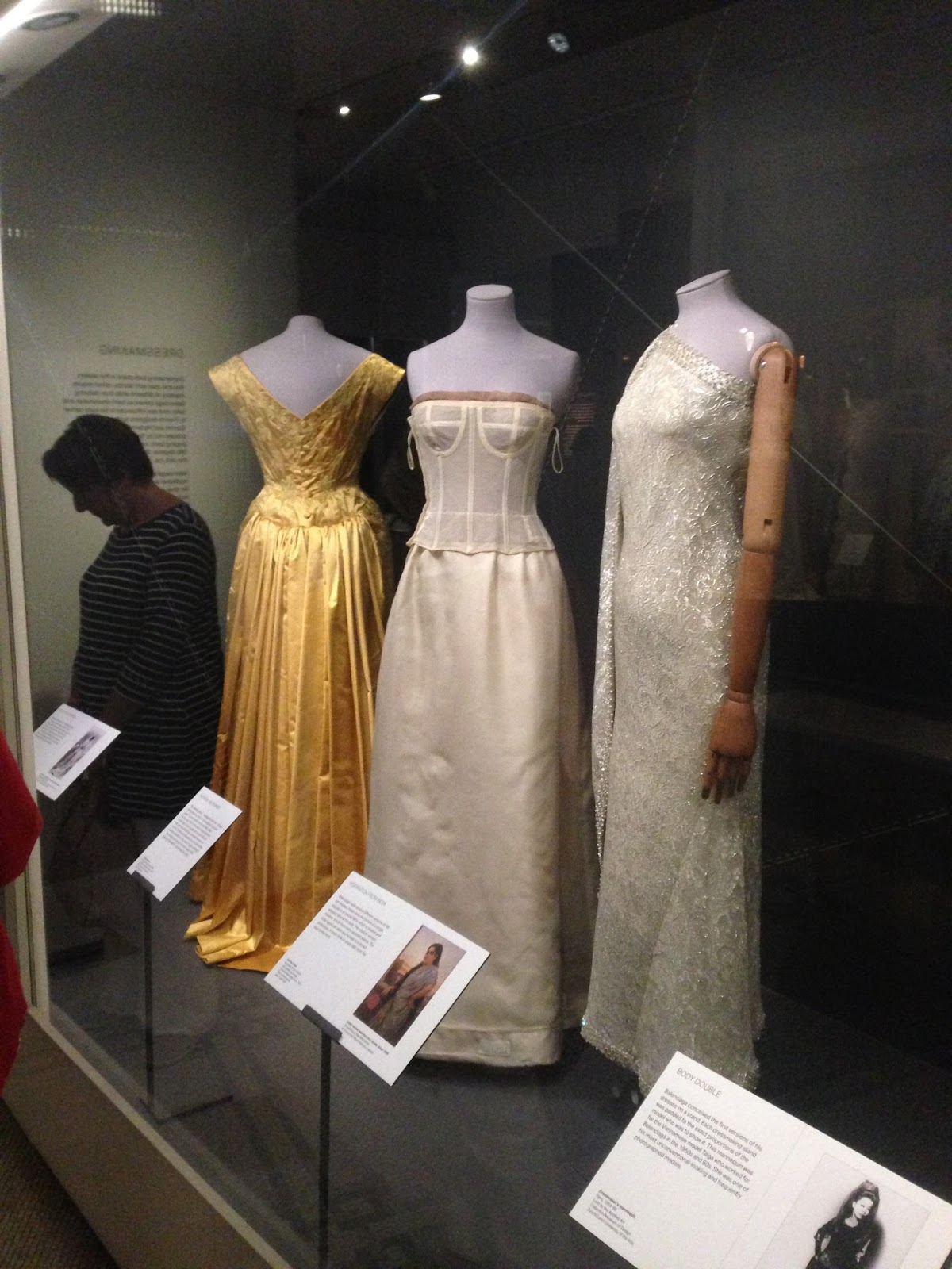
The right isn't a Balenciaga but someone inspired by him, further pushing how form can sit on a body, while also going beyond fabric (that said, Balenciaga was pretty experimental with material- the exhibition had X-rays of the dresses that showed the inner wires and other such contraptions that gave the dresses their shape) and creating something really amazing. There were other such dresses like this:


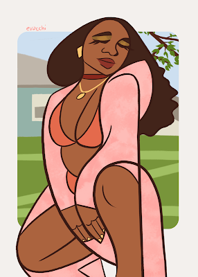


Particularly, I'd never find myself wearing Balenciaga but I'm really interested in it as art: it has such beautiful form and shape and I picked up some applicable wisdom while I was there (that an outfit should consider form, and the best types for flattery were mixing baggy/shaped and form-fitting in one outfit). He (and designers inspired by him, which arguably pushed the limits of fashion further than he did in his more conservative and less technologically advanced time) isn't afraid to use bold shapes and I found myself finding them interesting from a cartoon standpoint- I love children's animation with a diversity of body shapes, that pushes the understanding of the form of the human body (though I can take or leave the "mom figure" with the really wide hips because honestly it's tired?). I've been trying to simplify the way I use shapes and lines this summer, thinking about entire characters (or even just faces) as a square, or a triangle, and trying to stick to that:


Anyway, I wasn't expecting a revelation from the Balenciaga exhibition at the V&A at my nan's suggestion when she came to visit me in London but I really enjoyed it!

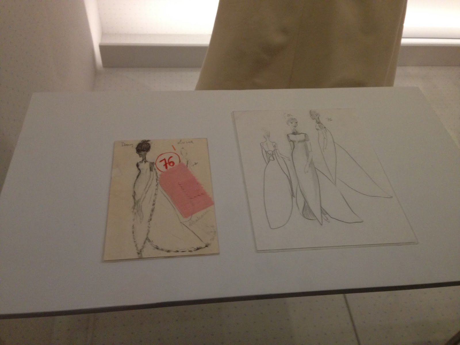
I thought it was great the drawings, which normally, I feel, rely on emphasis, actually translate almost perfectly into a finished garment. Like, truly a work realised? This dress, too, has no back seam and simply hangs off the front like a reverse-cardigan, and it works, which I think is great- I like seeing art that says "nah" to constrictions of the craft, almost, it seems, effortlessly.
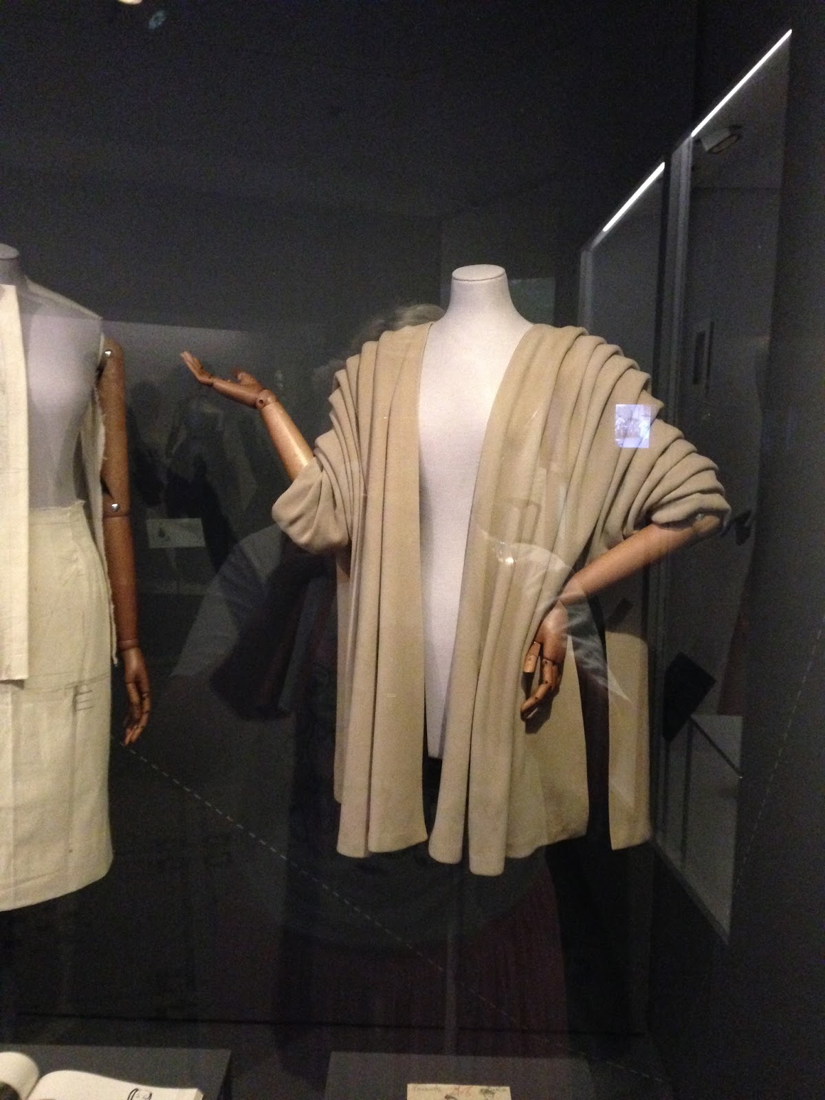


Like, there's really skill to thinking about simple shapes, designing an outfit that fits the form so well with sad shapes, AND executing it so perfectly in 3D such that every angle is beautiful.


I liked what this dress did too- there was no corset involved in what was (or looked like) a very tiny waist, simply properly shaping the skirt and shoulders made it look that way. (At this point I ran out for space for photos on my phone, but you can see something similar in the leftmost dress below).


For example, the left one was leather which made for a very dramatic dress regardless of the oversized hood and wide angles, and the right was a white and green dress with a what looked like a delicated pleated fabric formed over wire circles. These are, like the others, mildly stylised since honestly I'm done doing overly-detailed realism to impress people, I get a lot more out of stylising from life, but there is little emphasis- these really were the shapes of these dresses, and damn, were they beautiful.
I did some more fashion iillustrations from photos I liked over the summer after this:


They have a bunch of flaws and still really lack movement and dynamism which is what really irks me about my art, more than the change in personal style, and some of the shapes I'm trying to use forego basic anatomy, but I dunno, I'm trying?
17/08/2017
IPS: Thesis
I ended up changing my idea for my final year independent study. The original idea came part-way through the "BLOCK" project, meaning I hadn't fully solidified my ideas on either the current project or where I wanted to go next. Not to mention, all the deadlines were at the same time so I don't feel like I had ample time to consider a topic direction.
My original idea was a comparison between the Isle of Man and London and potentially urban legends as a commentary on gentrification. I'm not really sure what that means anymore?
After the results for my IPS pitch came back, it was clear my tutors weren't too enthusiastic about the idea I did have, while at the same time not offering particularly helpful pointers about where I could take the idea, if it was cliched etc.
What I in fact want to look at is the "character" of buildings, how building reflect their owners and what can we draw from this to build a narrative about gentrification in London. It' essentially almost the same point I ended up making at the end of "BLOCK"- "they will have forgotten there used to be culture here"- but looking more closely at the aesthetics.
The idea came when I was walking to meet my sister, through the backstreets between Falmouth Road SE1 at London Bridge City. I guess, there are a lot of urban gardens in my block but the ones round there are very pretty. However, that part of London has newer builds too, and I noticed the newer builds, the hip flats etc- looked so clinical, so un-lived in.
This reminded me of my shock at learning some of the results of gentrification on the Heygate site were already inhabited. Famously, all of them were sold to investors abroad, reportedly advertised in Singapore before the UK. I've seldom seen people even enter the building. It doesn't seem lived in. Perhaps it isn't?
I also recently have become fascinated with urban gardens, mostly because due to the summer, my neighbours have all made a beautiful job of making little gardens in the walkway outside our flats. At the same time, the council has locked the residents out of the communal garden I overlook, and I've yet to enter the Elephant Park "communal garden" because it's fucking gated (or "gated" is an understatement, there's a lockable DOOR), behind high-ass hoardings and don't think I didn't notice they put security cameras up recently.
I think the aesthetics of "living" somewhere can come through stronger than people realise. After all, we take these quirks for granted; what does make a flat different if it has a clothing line and a few plants outside it? But, from what I've seen, it says something about the way people treat their property and living space. I want to look at that.
05/06/2017
Personal Work Y2T3
I don't really like talking about my personal work for a number of reasons, most of them related to it being personal and a lot of it is just. Mindless doodling and stuff I draw on a Saturday night because I feel like it, ahah.
I went through something of a style change this term though, I'm not sure whether permanent or not. Mostly I just wanted to try something new and I was getting fed up with my work being so static. I also watched a bunch of cartoons that I really enjoyed the art styles of, as previously mentioned, particularly Danny Phantom, Dude That's My Ghost and The Loud House, and I wanted to take somethig stylistically from those that would both improve my personal work and help me stylise buildings.


I also started using Photoshop CC (instead of Elements 11) which meant I had suddenly waaaaay more functionality on my tablet and way more brushes to play around with, which meant I fiddled round with them a bit for a while before being influenced particulalry by the ink brushes and the effects I could get with it.
Here's a bunch of drawings I did early in the term, not including the ones I already posted as part of Cell Urself:


These didn't make enough of a change on my style even though they all use different brushes?? I did however at this point start lining things digitally, which is something I've been meaning to do for a long time, as pen takes ages to clean up and doesn't allow for certain styles and a degree of fluidity you can get with lining digitally. That said, that much pen control on a tablet is kinda of from muscle memory so it's reeeeally hard to get into doing it, but I've been doing it non-stop all terms so hopefully I'm improving.


I drew these for badges at some point but they're kinda rushed (hence flat colours) but they sell fine so I have no intentions of redoing them. However, I was getting really sick of my style at this point?? I feel like everything looks the same?


These for example are suuuuuper stiff and they just. Lack something.


But yeah it really doesn't work with the art style and I came to realise my anatomy is also crap. Or rather, my anatomy skills are heavily flawed but I know for a fact there are easier ways to shorthand anatomy such that it's less obvious, for example, simplifying the style. Also, it's going to take me forever to fix my awful anatomy so I wanted something more immediate that would pull me out of what was now becoming a little bit of a funk.


Most of this comes through in sketchbook work and pencil drawings which unfortunately I haven't scanned so "finished" drawing and doodles only to illustrate this, but again, I looked a lot at Kaz Aizawa's work and although I studied 0 faces and people (since he worked backgrounds) it was still easy enough to apply the way he formed shapes and lines to my current style and essentially make my current style more simple and angular.


I went through something of a style change this term though, I'm not sure whether permanent or not. Mostly I just wanted to try something new and I was getting fed up with my work being so static. I also watched a bunch of cartoons that I really enjoyed the art styles of, as previously mentioned, particularly Danny Phantom, Dude That's My Ghost and The Loud House, and I wanted to take somethig stylistically from those that would both improve my personal work and help me stylise buildings.


I also started using Photoshop CC (instead of Elements 11) which meant I had suddenly waaaaay more functionality on my tablet and way more brushes to play around with, which meant I fiddled round with them a bit for a while before being influenced particulalry by the ink brushes and the effects I could get with it.
Here's a bunch of drawings I did early in the term, not including the ones I already posted as part of Cell Urself:


I drew these for badges at some point but they're kinda rushed (hence flat colours) but they sell fine so I have no intentions of redoing them. However, I was getting really sick of my style at this point?? I feel like everything looks the same?


These for example are suuuuuper stiff and they just. Lack something.

It was at this point I got bored of the soft brushes and started fiddling round with the ink brushes. I've always wanted a soft, blendy style but my brain works best with cell shading and bold lines, I imagine because of the amount of manga I grew up reading and how that's shaded (particularly the work of Ken Akamatsu). I enjoyed the feel of the bottom left, which is a sumi-e brush (and screentone) and therefore fiddled around with that for a long while:


But yeah it really doesn't work with the art style and I came to realise my anatomy is also crap. Or rather, my anatomy skills are heavily flawed but I know for a fact there are easier ways to shorthand anatomy such that it's less obvious, for example, simplifying the style. Also, it's going to take me forever to fix my awful anatomy so I wanted something more immediate that would pull me out of what was now becoming a little bit of a funk.


Most of this comes through in sketchbook work and pencil drawings which unfortunately I haven't scanned so "finished" drawing and doodles only to illustrate this, but again, I looked a lot at Kaz Aizawa's work and although I studied 0 faces and people (since he worked backgrounds) it was still easy enough to apply the way he formed shapes and lines to my current style and essentially make my current style more simple and angular.


The style is far from perfect and I think it's still obvious my anatomy sucks but I feel like I understand more about?? form and direction and stuff. Plus I feel like the works themselves are clearly stronger as pieces?
Either way I'm happier with what I've been doing and I want to include more backgrounds in these like the ones I did for "BLOCK", now I have the time.
Subscribe to:
Posts (Atom)