Showing posts with label inspiration. Show all posts

09/10/2017

Inspiration: Shaping Fashion Balenciaga

I don't know much about high-end but if you've ever met me it's clear I do like fashion, and i guess I move to my own rhythm on it? That's not to say neither high end fashion nor trends don't hold inherent interest and value, it's just a matter of personal taste.

Particularly, I'd never find myself wearing Balenciaga but I'm really interested in it as art: it has such beautiful form and shape and I picked up some applicable wisdom while I was there (that an outfit should consider form, and the best types for flattery were mixing baggy/shaped and form-fitting in one outfit). He (and designers inspired by him, which arguably pushed the limits of fashion further than he did in his more conservative and less technologically advanced time) isn't afraid to use bold shapes and I found myself finding them interesting from a cartoon standpoint- I love children's animation with a diversity of body shapes, that pushes the understanding of the form of the human body (though I can take or leave the "mom figure" with the really wide hips because honestly it's tired?). I've been trying to simplify the way I use shapes and lines this summer, thinking about entire characters (or even just faces) as a square, or a triangle, and trying to stick to that:


Anyway, I wasn't expecting a revelation from the Balenciaga exhibition at the V&A at my nan's suggestion when she came to visit me in London but I really enjoyed it!


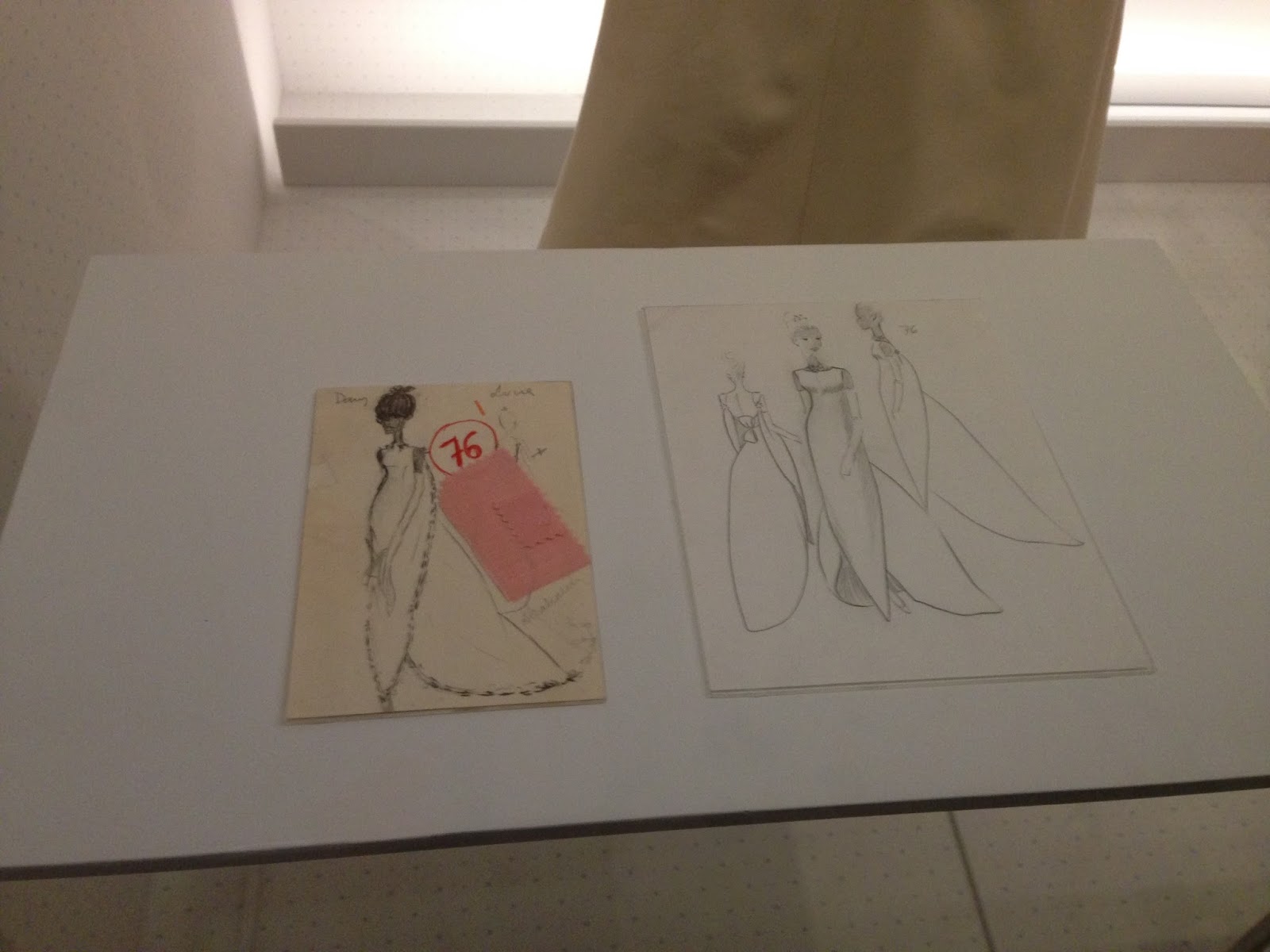
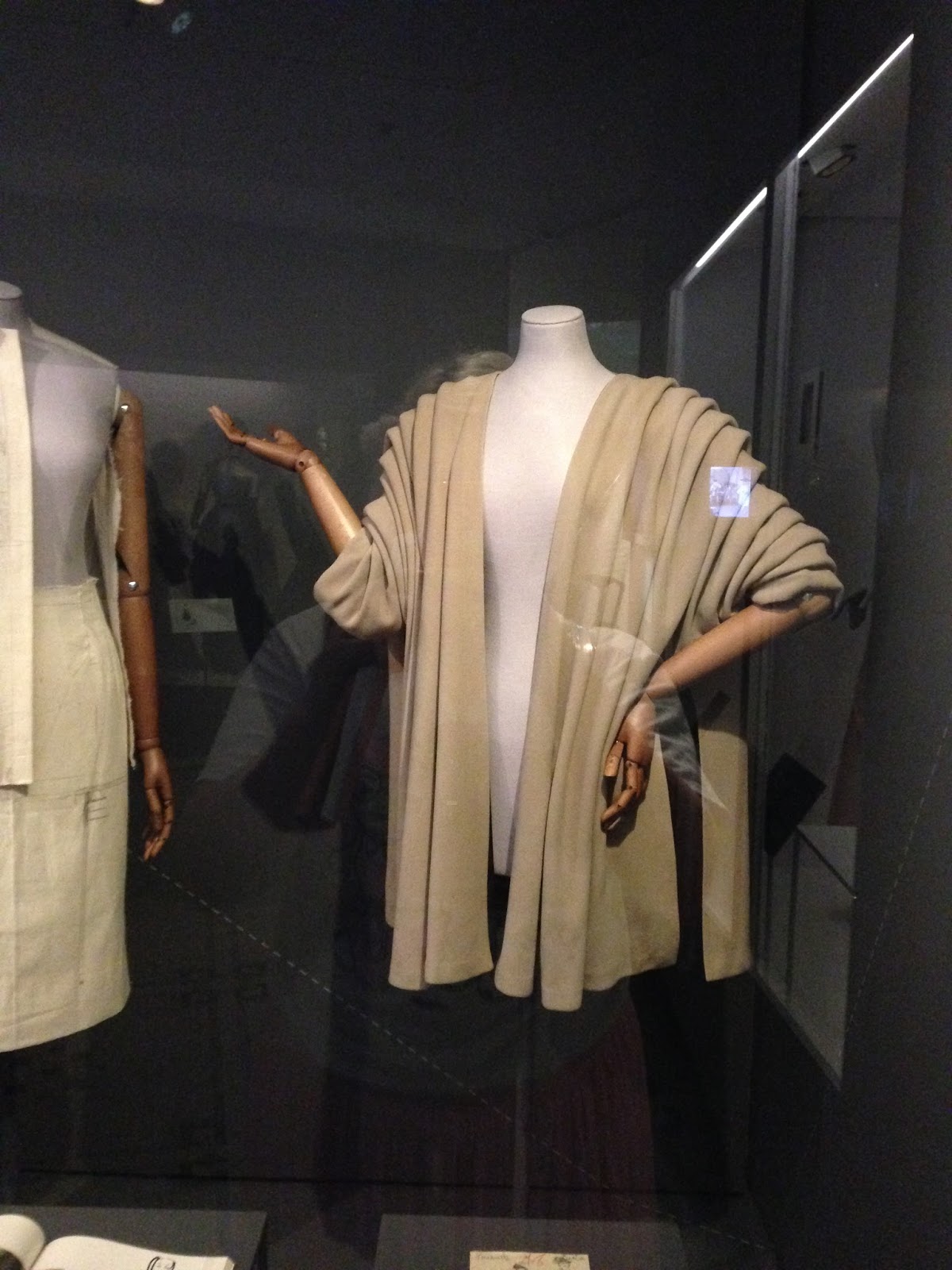
I thought it was great the drawings, which normally, I feel, rely on emphasis, actually translate almost perfectly into a finished garment. Like, truly a work realised? This dress, too, has no back seam and simply hangs off the front like a reverse-cardigan, and it works, which I think is great- I like seeing art that says "nah" to constrictions of the craft, almost, it seems, effortlessly.


The folds on this jacket were so sharp- they're held in place by a ribbon that runs down the inside of the sleeve.


Like, there's really skill to thinking about simple shapes, designing an outfit that fits the form so well with sad shapes, AND executing it so perfectly in 3D such that every angle is beautiful.


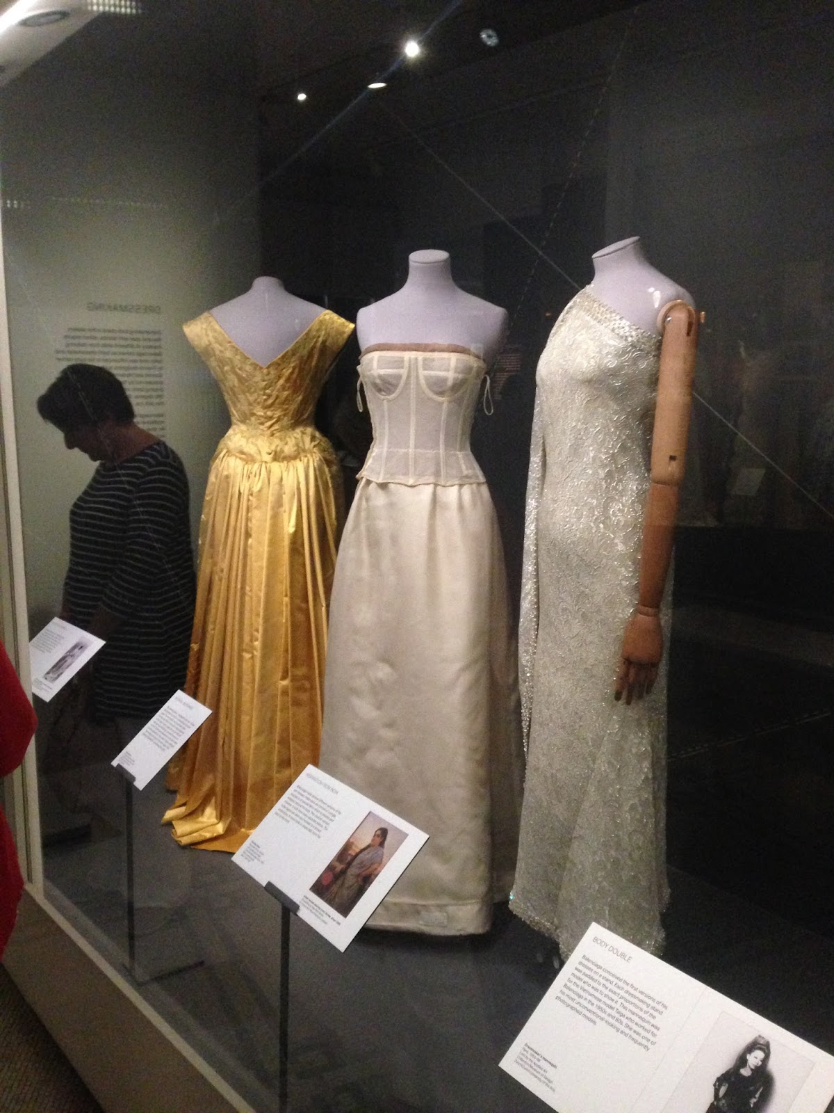
I liked what this dress did too- there was no corset involved in what was (or looked like) a very tiny waist, simply properly shaping the skirt and shoulders made it look that way. (At this point I ran out for space for photos on my phone, but you can see something similar in the leftmost dress below).


The right isn't a Balenciaga but someone inspired by him, further pushing how form can sit on a body, while also going beyond fabric (that said, Balenciaga was pretty experimental with material- the exhibition had X-rays of the dresses that showed the inner wires and other such contraptions that gave the dresses their shape) and creating something really amazing. There were other such dresses like this:


For example, the left one was leather which made for a very dramatic dress regardless of the oversized hood and wide angles, and the right was a white and green dress with a what looked like a delicated pleated fabric formed over wire circles. These are, like the others, mildly stylised since honestly I'm done doing overly-detailed realism to impress people, I get a lot more out of stylising from life, but there is little emphasis- these really were the shapes of these dresses, and damn, were they beautiful.

I did some more fashion iillustrations from photos I liked over the summer after this:


They have a bunch of flaws and still really lack movement and dynamism which is what really irks me about my art, more than the change in personal style, and some of the shapes I'm trying to use forego basic anatomy, but I dunno, I'm trying?


27/04/2017

Illustration Awards 2016

Some more old stuff from August 2016, when we went to the Illustration Awards in the Embankment Galleries of Somerset House. It was a suprisingly small exhibition.


I loved the right piece, a self-initiated cutout piece called "In the Water" by Sonia Alins. It's supposed to seem dreamlike, and I find there's something quite horrific about it, despite the somewhat calmness of the colours and the delicate cutouts.


This was a strange piece, on being trans, and I'm not sure it's it oversimplifies the issue in a good or bad way. It's hard to illustrate gender without using somewhat sexist iconography, given those are the associations we are brought up to make, regardless of their moral compass. It also highlights relatively well the feeling of having to hide being trans, given the woman in te tie takes a moment to spot.


I really enjoyed this book! I wish I'd gotten more pictures but I felt bad- it was so cute, a really neat idea (teaching kids history and science through the idea of time travel!). The art style is great, quirky but with still enough detail to be useful to teach, as well as aesthetically interesting for both kids and adults. It was also nice to see a BAME protagonist, and the history covered wasn't overly Eurocentric as it so often is, which was refreshing. Such a well thought out project!


These were super interesting too, putting politicians as characters from "Journey to the West".


A good range of book cover designs!


New Designers

Again, a little overdue but I went to New Designers in June 2016, which is a showcase of the graduating talent from UK university design courses. I mostly went because my friends from Birmingham City Uni were there but it turned out to be a really interesting event to learn about the standard expected of students, plus some of the projects were really neat.

The bottom floor (of the Business Design Centre, which by the way is a really nice venue and I wish more of the events I frequent as a trader would use it, it's like the Olympia but in a nicer area and with nicer toilets) was all product design etc, which, while interesting, didn't really make much sense to me as an illustrator. Also it's very much more a male subject and I got overlooked as a visitor a lot down there?


This one was pretty cool, it made for a neat unconventional advertisement (though apparently the ciragette butts used weren't collected from the beach ahah).


Please buy me a printer like this?? Holy heck!


The event had buyers and companies representing as well as the students, with a few students having their work picked up over the course of the show, which was interesting to see who and what companies were interested in.


I feel like the furniture design/textile design/illustration rooms were the nicest and most professionally laid out. 


I remember this one being Falmouth, who had really nice illustration work but I guess, a bit of a boring set-up, particularly lacking to use the middle of the room, which was really bare. The students didn't seem that interested in the going ons either, though admittedly it was very warm and the event ran for a good few days with long hours. I did talk to one girl who was cool though, she told me she didn't see where her work was going until the December of final year, which, for a student like me who feels so lost in the university system, was something of a relief to hear.


My friends' work from Birmingham City Uni! I think it was smart to set-up a shop, it meant students could reimburse themselves for the cost of the trip. I was told by other students from other unis that they had the cover the cost of the pitch too (around £2k) which was wild- aparently BCU didn't have to. 


A lot of the textile design as part of illustration was really strong, whic is cool but intimidating, since I quite like textile design.


I liked these display cutouts (both made for the show specifically to pitch the artist's work, and as a pitch in themselves as potential promotional material for fashion companies etc.


I'm not sure this was a student's work but it sure was a neat project on letterpress and the Underground.


This was an interesting rebrand of Flybe! Showed a nice use of mockups and UI design.


This was probably the work that stuck with me most- an ad campaign for domestic abuse awareness. The semantics of this project were really well thought out- the idea of scars and the truth as something so easily hidden, while also specifically not trivialising it and allowing for alternative versions of the poster by pointing out it wasn't a game. How these would work in the real world is a difficult one but it was still much sought after by attending buyers and companies, as you can tell from the business cards stuck at the top of the project.

The show had a really nice range of work (and expertise) and although I couldn't summarise exactly what I learnt, I feel like I picked up a few things here and there, and it was nice to connect with students further along in their university experience and learning what they'd done with their time on the course and what they'd learnt.