
During the summer I spent the week after working my butt off at Hyperjapan hanging with some friends I don't see too often and we went to a few different exhibitions (including the Cosmonauts exhibition at the Science Museum, which I wrote about at the time). MinaLima, a graphic design company in Soho had their pop-up exhibition on on the graphic design they did for the Harry Potter films, so we went there.
I've never particularly thought hard about graphic design for films, unless it's for animations, at which point I obviously consider all the design. While this might be because I don't particularly watch many non-animations, it was also really eye-opening to consider the work that goes into film design on its own. MinaLima is obviously a very good studio, obvious from their choosing for such a big film franchise as Harry Potter, and in their exhibited work.


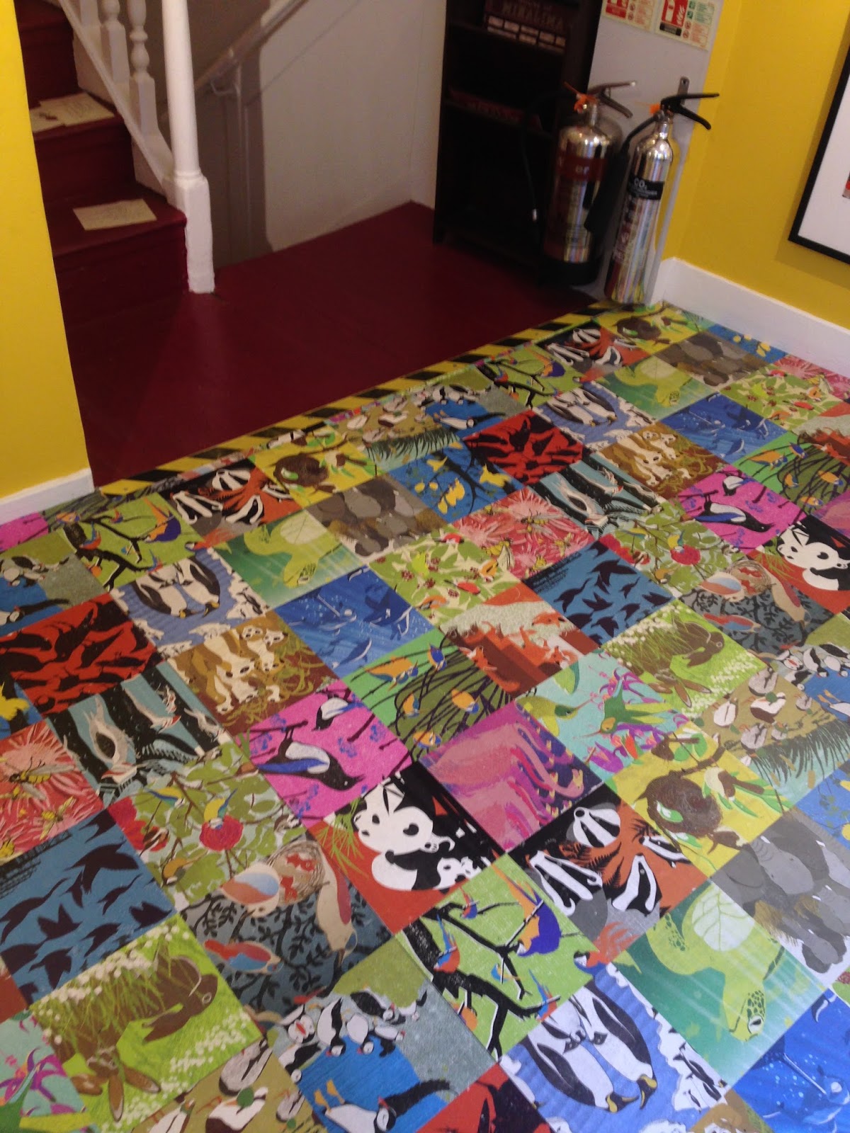
The first floor of the building was dedicated to non-Potter related projects, in this case, illustrating bold posters of animals in groups. The posters use striking colours to suit the bold use of flats, and maintain interest by often going for quirky animal groups and their names. The text placement is always careful and environment was well-considered when thinking about compostion and colour scheme.
They're also quite interesting for how they curate work: being in Soho, they have limited space and therefore have to manage it well in order to exhibit a lot of work, and yet not let it seem cramped or overly busy. They get by this by splitting the building's floors down by project, as well as using creative print techniques, such as wallpapering designs onto the floor and walls.


This works incredibly well with the newspapers and WANTED signs, giving the effect of mania and mimicking a typical setting for posters of these sorts, which in themselves are designed to be cluttered and imposing.
The Daily Prophet itself obviously takes inspiration from British tabloid press in the books and I liked that this comes out in the design, with the studio choosing very bold, facist fonts not unlike those of the Daily Mail for snappy headlines. That said, they also have that ~wizard-y~ twist, with inspiration from Victoriana, particularly in the illustrated adverts (bottom left of the last photo), as well as something of quirkiness in the way the direction of font changes.


I particularly appreciated that they pay close attention to the use of their design and let that inform their choice of materials: for example, designing a Hogwarts wax seal and embossing the Chocolate Frog packaging with gold (also, while writing this, it just occurred to me that Chocolate Frogs are probably inspired by Freddos! Woah). The diversity of design and uses while still retaining a sense of personal flair is also amazing.


No comments:
Post a Comment