
Jade Boylan is an artist and designer from the Isle of Man, where I lived for 14 years. The IOM has a population of 80,000, much of that a farming community and in general very closed-off to wider trends in the world. When internet became more accessible and young people got interested in trend such as street fashions like goths and scene kids; or art trends like the increasing popularity of manga, there was never an outlet in real-life for such interests and it was very frustrating trying to get inspired beyond appreciating the landscape.
Hence, when I wandered in to Boylan's BFA graduate show in the local shopping centre, I came face-to-face with art that expressed my interests and aesthetics in a real-life setting. I've followed her development ever since on social media, and I like that she experiments in branding her "Candy Colour Your World" girls, as inspired by the original pieces I saw at her graduate show, as well as trying resin and wooden jewellry. It turns out she was also taught by my father (a private school Physics teacher) who told her about my art after I'd left, which is weird but cool, and also demonstrative of how island life works (everyone really does know everyone).

This piece "Cry Baby ❤️" is probably one of my favourites, and is inspired by the original "Candy Doll Club", nly mixes in twists of Lolita fashion as well as American electropop singer, Melanie Martinez, who Boylan says "is basically like a real life 'Candy Doll' complete with pastel hair, sweet tattoos and the 'don't mess with me' attitude that every Candy Doll embodies". The piece uses more pastels than Boylan's trademark of birghter, more saturated colours, yet still is her own. I also like that the pieces are created traditionally with acrylics, spray paint and posca, rather than digitally- there's more of a sense of individuality and artistry to it, especially the seamless shading.
Edward Bawden was a graphic designer specialising in linocuts of 20th Century landscapes, most famously indoor markets. I visited The Higgins Gallery in Bedford when I first moved to Milton Keynes where they had an exhibition of Bawden's wallpaper designs- I'm not sure why they were exhibited there but Bedford has a very industrial past so it's possible it has links to the production of the wallpaper, even though Bawden lived and designed in North London.

I was very struck by a huge copy of Bawden's linocut of Smithfield Market taking up almost the whole wall inside the gallery (although I don't think it was meant as a wallpaper). Moving back to the UK and starting A Levels meant I felt I needed to make my work more sophisticated, and Bawden's work was relatively simple to execute in theory but looked more "adult" than my own work up until then. Thinking like that is somewhat misguided because it's based in an internalisation that my line of comic or manga-inspired styles are somehow childish. I think my interest in this was also spurred by getting into the British zine scene, wherein zines need to be cheap and therefore as effective in style and economic in use of colour.
Lucian Freud doesn't really fit with what I and other people see in my work but I find him an inspiration all the same. Freud is an artist who died in 2011. He lived in London but I discovered his work whilst living back on the Isle of Man, and later planned to go to an exhibition of his work (along with that of Francis Bacon) in Norwich but the trip was too expensive.

"Standing by the Rags" is a both a painting and a nude, the two aspects of Freud's work I find most interesting. I tried to recreate his fleshy painting style once but of course it's far harder than it looks; his painting technique is world-class. I like particularly his female nudes because the female body is rarely presented as so incredibly real or non-sexualised, so a nude that seems less elegant or appealing and more grotesque seems like a rare sight, though I somewhat doubt Freud had gender politics in mind when creating these works. I also like hyperrealism, and although this might not be the first example to come to mind when considering hyperrealism, Freud pays much attention to accentuating the idiosyncrasies of the skin and how the light falls (eg, the fact the legs are different shapes, the use of blue in creating a cooler palette of colours, and the intense white highlight under the navel) that I'd argue Freud is hyperrealism, even thought the paintwork is more impressionistic.
Comic artist and illustrator Sally Jane Thompson is one of my bigger influences, I think I originally picked up one of her comics at comic con and really liked it, and have since probably bought all of her publications, attended her gallery show at Orbital Comics and met her at Thought Bubble Sequential Art Festival last year. Her "Nouvelle Manga" style is very simple (although every now and again, her full-page landscapes are stunning) but her stories are always really well thought-out and in touch with the complexity of human emotion.


"Atomic Sheep" is my favourite of all her comics- the story follows Tamrika starting at a private school and trying to work out what she wanted to do with her life. Although the work is clearly inspired by Thompson's own experiences, I originally read the book when I was the same age as Tamrika, also having moved to a new school in a relatively new country, so I saw a lot of myself in the character as well as some differences, and the humanity of the story came as a comfort, as well as pushing me into deciding to go to art school. There's something soft about the colour scheme and Thompson's panelling always flows so well (for example, the water motif above continues into the next few pages as Tamrika dyes her hair). I also appreciate female illustrators, and female illustrators who tell female coming-of-age stories at that.
Lize Meddings is also an illustrator, whom I also met, but only briefly, at Thought Bubble. She is based in Bristol where she mostly works promoting and drawing for "The Sad Ghost Club", an illustration-based movement to promote awareness of mental health. However, I also like her more personal work, including her WIP zine on "cute and colourful confessions".

Meddings' sequential work is always really interesting as it tends to work more like a triptych than a comic, pulling the viewer to pay attention to smaller details and movements and adding a sense of stillness and serenity to her illustrations as the viewpoint, and therefore the viewer, is still. Even though she uses mainly flat colour, her compositions are really stimulating in terms of colour (for example here she uses two limited palettes of complimentary colours). The way she draws her characters is also really unique- they're always stuck with a look of slight suspicion and the big, cauliflower-like noses are unusual and set Meddings' work apart.
Fran Knight is a designer for Baku Forest Studios, an independent jewelry business based in Gloucester. Her designs are generally small, intricate details printed onto wood or clear acrylic, though she has also done work with laser-cut coloured acylic for "cut-out"-esque designs.
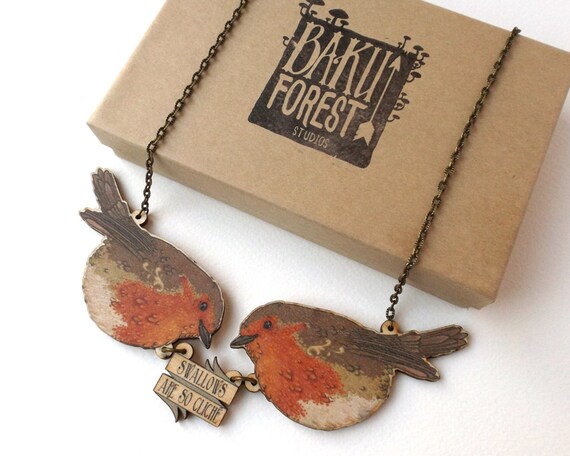
My favourites of her designs is the "Swallows are so Cliche" series: tongue-in-cheek, witty and inventive, as well as chic. The necklaces also sit well and don't irritate the skin as no parts of the design are too spiky, showing an awareness of good, wearable design as well as great craftsmanship.
Brogan Coral is an illustrator from Manchester with a very distinctive style; inspired by manga but also by Art Nouveau, using very blocky colours to create a sort of crystallised effect in her illustrations. She also has a good sense of colour, often but not always sticking to pastels to lend into a certain "branding" about her art. Coral does comic conventions but I've never met her- last time we were at the same event (MCM London) I didn't get time to see her, but my friend picked up some signed posters on my behalf.
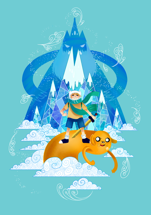
Although not representative of most of her work, which is mainly girls with a very decorative style and eccentric fashion/accessories, I love this Adventure Time illustration (also my favourite illustration wasn't on her website for some reason). It also demonstrates both Coral's shimmery style [in the mountains] and her attention to detail- the clouds are very much Art Nouveau as well as perfectly executed. It's also very compositionally sound; self-contained but not bland, and the warmer and more vibrant colours of Finn and Jake means the eye is drawn to them, and then upwards by the shape of the mountains into the cooler colours of the Ice King.
Roxie Sweetheart is a British fashion designer based near Portsmouth, inspired by cute and creepy aesthetics alike and British and Tokyo street fashion. Her designs are always very vibrant and rich in details.
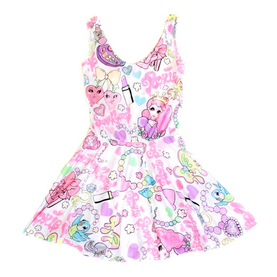
This design, "What a Girl Wants" pulls inspiration from a number of places and therefore invokes a sort of cultural clash, including aesthetics from retro manga, vintage patterns and Barbie branding alike. The eclectic nature of the pattern makes it interesting to look at but a strong colour scheme means it isn't too busy or loud. I also like the mixture of black in with soft pastels- it gives some of the designs a hard edge, very much fitting for what Roxie Sweetheart wants to achieve with her designs "cute with a twist".
Tracey Emin isn't an artist I actually like a lot, but coming from such a small island, I rarely had the chance to go to galleries of museums such as the Tate because the price would have to include a plane ticket rather than just a train or bus; hence, artists that pushed the boundaries of art weren't something I heard about. Hence, when I read about Emin (specifically, her tent) I was really surprised by what could be art. Emin says things in her art that seem too real, or often scandalous, to be said in a hushed gallery or elitist art world.

For example, I really like this, "Hate and Power Can be a Terrible Thing" as it clashes a "feminine" presentation with politics, jealousy and psychosis. The quilt is reminiscent of teenage collages, only the actual words and the fact it's textiles seem contrastingly adult, as if Emin is making a statement about how women are often belittled to "girls" while being very much adult, with responsibilities, fears and regrets. The lack of order or reason to the layout also adds to the random nature of the words themselves, laid out like fleeting thoughts, spelt incorrectly, fabric frayed or misaligned, or written as if part of an unfinished story or train of thought. Lastly, it seems Emin is promoting radical feminist principles of the "feminine sphere", of feminine crafts being women's retaliation against the "male" world of politics by putting her point across via fabric, even though her slapdash attempt seems to suggest bitterness, as if caged by "feminine" pursuits or, of course, driven by the bitterness displayed right there in the artwork.
Then again, the reason I dislike Emin is because even though I read that into her artwork, I don't believe it's what she had in mind: women with power are rarely feminists since that's not how the patriarchy works. However, the internal argument between what I see logically and what I see in her art in a personal sense is exactly what originally caught me about her work.
Plus, it makes me smug to misunderstand artwork because if artists wanted to be better understood, they should have become illustrators.
No comments:
Post a Comment