
The initial brief was to use our sketchbooks from "Subject Object" to decide on some "needs" for a being that is, in evolutionary terms, just emerging from the primordial soup, out of which we'd make a full bodysuit. I think I could have gone simpler with this but I was constricted by what was in the original sketchbook.

My creature designs therefore seem over-complicated, although they do stick to the themes quite well. I didn't get any feedback on these either, which I think would have helped, as when I reflected on other people's creatures I found they barely took notice of their needs, many of them very simple and therefore easy to construct designs.


This kind of felt like designing Pokemon. The later designs are more "primodial" but still not simple enough. Incidentally, before I was ill I did start a bodysuit based on the second and third designs, made from two linked wire domes draped with canvas and dripped with green poster paint and, eventually, melted wax. Unfortunately, I couldn't find it after I returned to the studio, so I can only assume someone put it in the bin where it quite honestly belonged.
There was also a group video project using the creatures but again, I was ill (and partially avoided) this bit. Looking at other people's projects made me pretty sure I did the wrong thing in the design stage anyway. A lot of the concepts were really abstract which doesn't really work for me- I do illustration because I like things to have some kind of meaning, though I understand that "meaning" is pretty broad.
The next bit was putting together a society for the creatures to exist in and a manifesto zine to explain it, which I played a big part in. Thankfully, a lot of the people I worked with split up their original groups meaning it was possible to start anew with a group of people, therefore my lack of creature wasn't a huge issue. This also meant I could play a big leadership role, which is one I naturally assume, particularly in a topic I know so much about such as politics and sociology.
The video from the majority of our group was based around cannibalism and ritual, so we started with these ideas and brainstormed a society that has this at its core. I thought it'd be much creepier (as well as more feasible) if the consumption of other beings was based in something positive like sharing and community, in the same way Communism has very positive core beliefs but results in figures such as Stalin and the Kims of the DPRK.
[image]
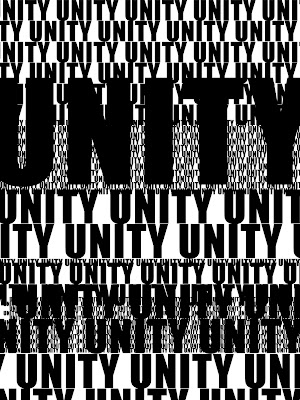
We also looked at a lot of tribal art, mainly the Mayans. This was less to do with some look at "savagism" as the Mayans were actually really intelligent, and more than Mayan art lends itself well to narrative, as well as being easy to mimic. It was important to the whole group that the book, like the society itself, have a very strong sense of unity, to properly get across the cult-ish feel as well as make it a good zine. I also personally looked at totem poles in order to come up with an idea for the circle of life.
Actually putting artwork together was pretty challenging, as people worked at different paces and one of the group members kept falling back on an idea the rest of the group had rejected two days earlier instead of drawing. I should also point out the whole project was done in 5 days, which included paginating etc!
As leader, I made sure everyone had sketches of their final idea so we knew what everyone was doing, before sorting out a layout and doling out jobs so everyone had a clear focus.

This design was based on some research of Mayan designs where I felt the subtle figure of 8 leant itself well to thoughts of unity and eternity.


I then mixed the Mayan design with the Native American totem pole structure in order to form a cult-ish narrative that flowed better. The tiny creature under foot is a reference to traditional Chinese sculptures, specifically those at the gates of the Forbidden Palace in Beijing. A dragon with a child underfoot is a female, so I wanted to get across that "Daddy" is a deity separate from the general understanding of what "daddy" means.


This was the complete thumbing for the project, including some filler pages. It was also considered at this point that in order to unify the book, we should use not only the same style, but have the same colouring, which we decided would be using self-made monoprint textures overlayed on the ink drawings- there was a suggestion of doing actual monoprints but at this point we were very constricted by time.
We also (very last minute) felt the zine, being majority pictures, didn't put across everything we wanted to say, so decided to produce some text collages and a font to input some keywords into the images.


Charlotte designed these as instructed, but I also designed some, given I knew what I was thinking, and we ended up using mine (yup, that's the kind of person I am huh):


I also (incredibly last minute, we're talking 3am here guys) designed a font.

I went originally with scrawly, rushed lettering, but when I fed back to the group on Facebook, they much preferred a more innocent, childish lettering. Hence, I did some keywords with this, writing out each word rather than the whole alphabet as I both didn't need the whole alphabet and wanted little discrepancies between words to keep it looking authentically childish.

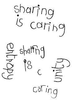

The phrases were all brainstormed by other members of the group, based on some reading we'd done earlier on The Linguistics of Horror based on internet tropes and popular podcast Welcome to Night Vale.
The book could eventually therefore be put together and paginated by the one person who has InDesign, which was poor Chris.


This was the cover spread, done by Aimee, and coloured by either Chris or Aimee, I don't know. It' based on her creature- we didn't want "Daddy" on the cover because he was more mythical, and societies that emphasise the everyman would use a citizen on the cover- like getting government leaflets with a bunch of smiling, racially diverse stock photo models, doing Normal Things (TM) like wearing a hard hat or something.


This was my submission of a four-page "cycle of life". I'm not sure it makes total sense to an outside viewer and it might be a little underwhelming bu the quality of the drawing itself is pretty good so I feel OK about it. I did a bunch of variant coloured versions, from which the group chose their favourite.


These were Charlotte's and Chris' drawings respectively. Chris completed all but the text on his, and I again coloured Charlotte's. I feel like this page works well, and it's great that Charlotte and Chris managed to get it to flow so well despite working on the pieces separately.


These are probably my favourite pages, drawn by Aimee and coloured by me. She used the idea of a strawman comic and made it creepy, as well as working in Illustrator for some really neat lines. I particularly like the contrast over the spread, and the composition of the second piece.


Timos was the most difficult member of the group, not getting his piece finished until hours after the end of college on the last day (which I had the pleasure of waiting round for) and submitting a very messy drawing when he could definitely do better. I therefore cleaned this drawing up a lot (and coloured it), before noticing that we could no longer use it as the intended spread as Timos had done the dimensions as a single page. The other page is therefore a very last minute filler page again, and if it looks familiar, it's intentional. The project did end up being a slight ode to internet tropes and memes.


This page used my text, and Chris designed a cool blood drip effect for a better layout.
The zine was risographed and was kind of disappointing qaulity, though this might be down to the PDF being saved too small- which highlights one of my biggest challenges of this project, which was getting everyone else up to speed with Photoshop and how to do things like scan and clean up an image. However, working in a group was very rewarding and although the zine could've been better if the group had managed its time better, I think it came together relatively well.
Also, a colour version of my spreads:

No comments:
Post a Comment