


A major theme of my current personal work (and one of my A2 Fine Art project) is Harajuku fashion. Here I like the superfluous details and the sense of personality it injects into an outfit using trinkets, layers and carefully coordinated colours to create something fresh- like seeing idioyncrasies in the decor of someone's house such as an open book or a dying plant, only here those points of interest are displayed on the body as something akin to wearable art.
Aesthetically, I also like the idea of incorperating anime art into something that's not anime; anime styles of illustration are great but seldom stand out from the crowd, so anything that mixes anime-styles with something such as fashion or anime-inspired illustration to create a unique piece away from just anime really interests me. I'm also all about pastels!!

For example, Natali Koromoto is an American artist who's art is clearly inspired by anime (to the point of using a Japanese surname alias in place of her real surname, Martinez) but who is also in tune with current [Western] illustration trends. She has a huge portfolio of work but this one caught me because of how it makes the viewer do a double-take; juxtaposing a "cutesy" style with something far from that aesthetic, yet somehow making it work (the cockroaches for eyes is smart).
The execution is also really neat and in particular the lines works so well in harmony with Koromoto's choice of colours- I love using a black brush pen in my sketchbook but it seldom leaves my sketchbook as I find it really difficult to synthesise strong black lines with colours. The form is also great to- I love seeing "beauty" reassessed, not least with bugs but also large ears, a rounded face and flyaway hairs on a female-presenting character.

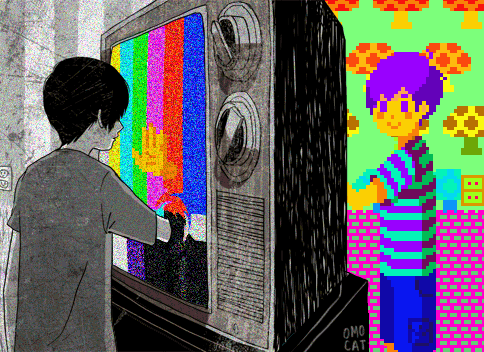
Similarly, Ghoulkiss is a British illustrator who draws from two opposing interests- grotesque body horror, and cute and "feminine" styles, resulting in very unique and eye-catching work. Even though her colouring tends to be flats only, her compositions still pop because of the bright and sometimes clashing colours, as well as the quirks in her form (I particularly love the way she draws hands, abandoning trying to make them realistic and instead giving fingers more life in their direction, bending in ways hands shouldn't and yet still not looking odd to the viewer).
None of her illustrations have a blatant concept or judgement of its content, instead her characters are the centre of attention, with some overriding theme always present- sometimes somewhat abstract, like "BON-APPETIT". Ergo, whether her work is really illustration or not is debatable- I'm too in awe of her sense of aesthetic and execution to notice the themes of her illustrations personally, and her portfolio lacks client-based illustration to show how her art could be used as illustration. In a way though, I sort of like illustration where the line between art and illustration is blurred, as it means one can retain more personality when approaching briefs, and you are less likely to get approached by people looking for "hands for hire" (as an illustrator friend once put it).

Besides the fact that of course all ice-cream is great, I was really taken by the cleanness and general simplicity of this Japanese ice-cream advert. I think I originally just wanted to do a study of it, but recently I've been into theming character illustrations around food/drinks (eg, bubble tea), so for example keeping the shape of the glass but turning it into a dress design would be cool. Either way, this image isn't particularly special in the way it is advertised or laid out, yet is still very appealing and inspires a lot of ideas for me.


"The Match Box" by French artist Soufiane Mengad is an image I like mostly because the painting is incredible- it's drawn digitally and yet so perfectly mimics something like oils or gouache. The detail in the water isn't over the top, more gestural, and so the eye is drawn to the perfectly executed bubble and flame. Of course, the content is also eerie yet familiar- the uncanny, in that Mengad uses everyday objects and puts them together in a very involving yet inexplicable scene. I suppose this would be counted as Absurdism which has also always interested me as a movement (I wrote about Tom Ngo for AS Fine Art, for example).

This is Daeg Faerch, an actor, which is irrelevant as I have no idea who he is. I was drawn to the image not only because of the strange intimacy of a gaze from someone I don't know, but also because of the unforced androgyny of the model. As someone who believes in the androgynous nature of all human beings, the undefinable and yet real physicality of androgyny is something I find fascinating. Furthermore, this seems to blur the lines between childhood and adulthood- Faerch has a strong jawline but remenants of puppy fat. Although male coming-of-age is not underdocumented, it does tend to be something that's the butt of a joke rather than something to be admired, and Faerch's gaze says he isn't uncomfortable with his body, in what could be construed as a small rebellion against the expectations of masculinity.


I take a lot of inspiration from cartoons and although I'm not majorly keen on the art style of Disney's "Gravity Falls", I do like the backgrounds, and in particular this one by Ian Worrel. The thing I like most about the feel of the series is the sort of American Gothic summer- untouched wilderness, small-town America, and blisteringly hot days where mysterious things are afoot- and Worrel captures this perfectly here, as the animated version of the image was used to close the first series. Compositionally, having the trees slightly out of focus in the foreground give the idea of being inside the scene rather than looking at it, and perfectly frames the Oregon countryside. The textures and lighting is also really good, perfectly capturing a sort of late-afternoon effect.
No comments:
Post a Comment